Conf by conf, day by day, still making pancakes
How the Upscale brand grew, one edition at a time
The first Upscale Conf, Magnific’s conference for people creating with AI, happened in Málaga in 2024. Nobody on the team had planned an event this size before. It was brave and a little unhinged, and that’s exactly what made it exciting. Lots of people came, and it worked.
But let’s be honest: it was a first pancake, the one you make before you know the pan or the batter.
We were figuring out the event, the content, the venue and the brand at roughly the same time. There wasn’t a huge master plan behind any of it. We made things, saw what worked, changed things and learned a lot very quickly.
Since then, Upscale has grown to more than 1,000 people, and the brand has had to grow with it. We know the pan a little better now, but every year still seems to find a completely new way to surprise us.
Same same, but different
For edition two, San Francisco 2025, I took over the branding. Upscale was only one edition old, so I wanted it to feel the same, but I also wanted it to feel different, because the original wasn’t really my cup of tea.
The logo and typography stayed, but the colors got more fun. I started playing with what else could change while still feeling like Upscale.
This is probably where you’d expect the research: references, moodboards, rounds of feedback and a convincing explanation of why every decision was strategically inevitable.
There wasn’t any. I just liked it, and so did the team. The original felt a bit corporate for a room full of people making weird things with AI, and I wanted it to feel like them.
Conffor people doing the creative work
As Upscale grew, I wasn’t making everything myself anymore. I was working with a designer, videographers and social, which meant the things that had mostly lived in my head suddenly needed to make sense to other people too.
For a while, my solution was basically to say, “No, not like that,” in increasingly specific ways. Eventually I had to admit that wasn’t a particularly useful brand guideline.
Social templates were the first proper step to a brand guideline. From there, the system grew mostly because it had to. Things that had lived in my head were given actual rules: how we use color and type, what stays consistent, and where there’s room to play.
When the brand leaves the screen
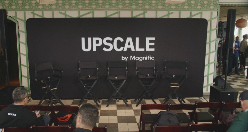
Designing for an event means the brand eventually has to become an actual place. The same identity suddenly needs to work on a giant stage screen, a tiny badge, a wall, a T-shirt, and a sign someone needs to read while they’re desperately looking for coffee.
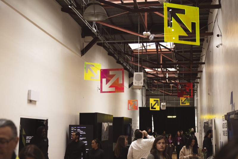
For a long time I thought of all this as a design problem. Make the space look right, keep the brand consistent, make the stage look good. Turns out that’s only half of it.
A beautiful idea isn’t worth much if nobody can build it, it blows the budget, it’s made of the wrong material, it blocks the whole venue, or it looks amazing in person and terrible in every single photo.
So a lot of getting better at this had nothing to do with design. I learned how to work with vendors. I learned about materials and production. I learned to spot when something that looks super simple in Figma is going to be a nightmare to build (usually the fun ideas). And I started thinking about how people actually move through a space, not just how pretty it looks empty.
Floor plans are still one of the hardest parts of every event. They take months and months and change constantly as sponsor booths, activations and new ideas get added. Every new thing shifts something else: where people walk, what they see, what gets crowded, what suddenly needs to move.
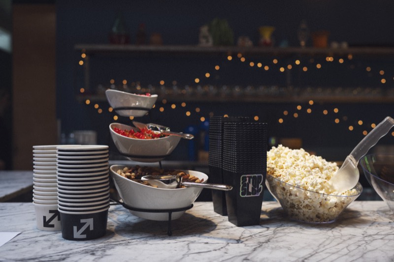
It seems easy on paper, but in reality, you’re trying to predict how hundreds of people behave in a space that doesn’t exist yet. Guesstimating what people will queue for is a fun risky game we play every edition.
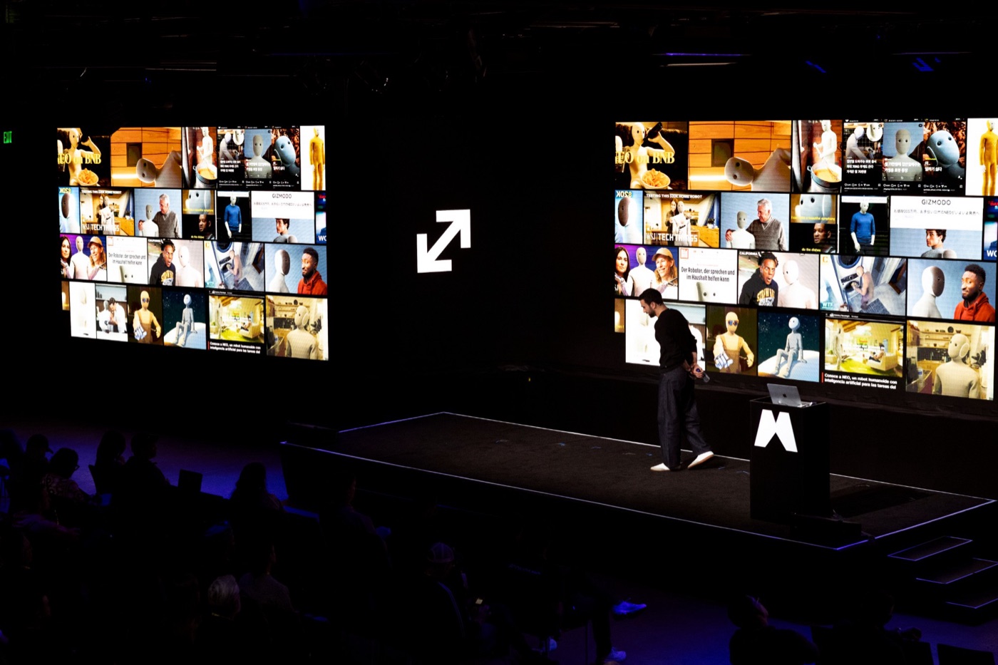
And then there’s the slightly ridiculous part: you’re designing two spaces at once. There’s the real venue, and the version that lives online afterwards. Everything has to work when you’re standing right in front of it, but also when it’s photographed from twenty feet away, cropped into a vertical story, or sitting behind a speaker in every photo of the day.
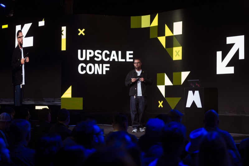
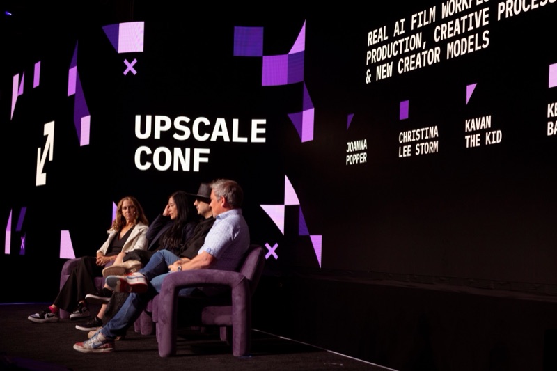
The stage screens are the thing I obsess over most. They’re huge, they’re behind every speaker, and they end up in pretty much every photo of the talks. I can stare at them on my laptop for days, but I never really know how they feel until they’re glowing behind someone on stage.
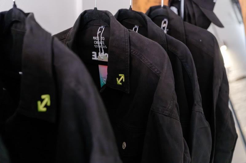
Colors are kind of frenemies too. Our neon yellow looks great digitally and somehow behaves beautifully in embroidery, but for traditional printing, it’s nonexistent. Ink, light, fabric, vinyl and thread all have their own interpretation of what your brand color should look like, which is something I hadn’t fully realized when playing around with the hex codes.
By the next Málaga edition, the brand was asking for more personality. The Málaga venue is huge and we had a stage, walls, screens and a social feed that constantly needed something new, so I took apart the arrow logo and started using the graphic elements as a part of the branding.

The first shapes, made by reconstructing the arrow logo
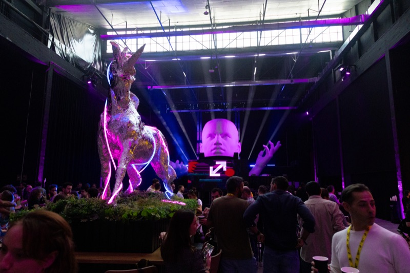
The venue also had sculptures we couldn’t move, so we wrapped them in aluminium foil and neon lights.
I admit that this idea was very much “out there” and I defended it with more stubbornness than evidence, but luckily, it looked dope and original and people photographed them all day.
I’m guilty of loving clever copy (I mean, have you seen my merch?), and apparently, empty venue walls were all the encouragement I needed to make funny text a staple part of the branding.
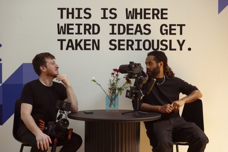
There are lots of unexpected obstacles you run into when designing events. You have to adapt to the building, the light, the materials, the budget (the most annoying one), the things that arrive late, or the things that can’t move.
But I love a challenge, and turning problems into something that looks like it was meant to be is always fun.
The things people notice
I am very detail oriented, and sometimes that makes me spend an unreasonable amount of time on things that feel tiny compared with everything else going on.
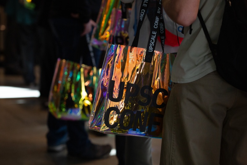
One of them is badges. Those little suckers have been the bane of our existence almost every Conf. Because I care too much and want them to look a certain way. Getting them made might have caused a few early gray hairs, but that’s a separate story.
I believe they are super important because it’s the one thing that every attendee wears all day and usually takes home, so suddenly this supposedly small thing needs to be readable, survive two days of being thrown around, and preferably look good in photos.
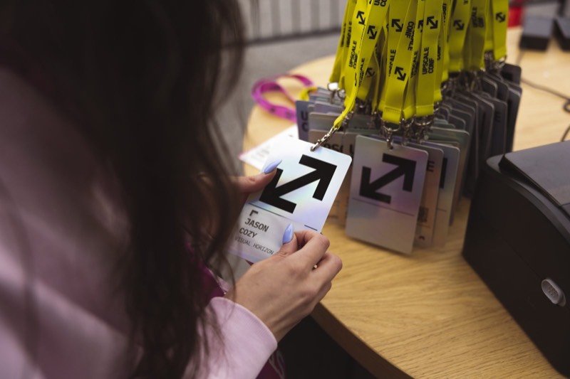
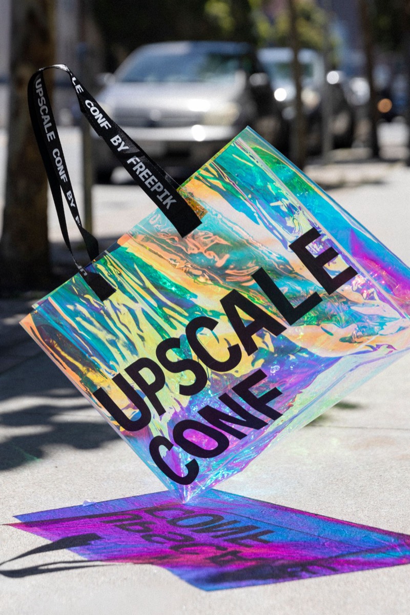
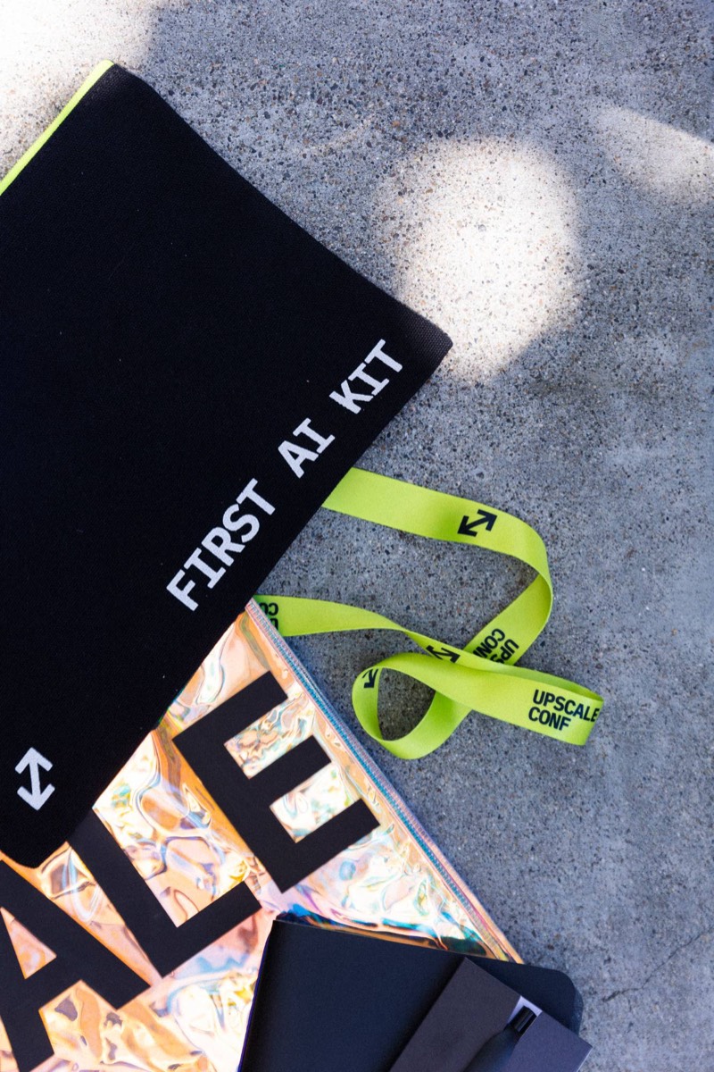
I can obsess over the smallest things like signs, wristbands, merch, sponsor activations and all the little bits around the venue. You can spend hours on one detail, usually alone in front of your laptop, and eventually start wondering whether any of it matters to anyone but you.
Then people show up and notice. They tell me they love the badges. They get excited about the merch or point out something in the venue design. And every time it happens, it warms my tired little heart and soul.
Growing up, with supervision
The few colors and type turned into a collection of templates and rules, and then into an actual brand guide.
By San Francisco 2026, those loose rules and templates weren’t enough anymore. The original three colors became a full palette with proper shades, I redrew the graphic elements and wrote rules for making new ones. The goal wasn’t to lock everything down. It was to give everyone enough structure to work with the brand without me hovering nearby saying, “No, not like that.”
The first three colors and the full palette they grew into
I also redid the website to include more of these elements there in a playful way.
Somewhere along the line we started running Upscale Days.
A Day is basically a one-day Conf: one city, a smaller crowd, the same brand and a tenth of the stress. (Still some panic.)
The Days needed their own energy without becoming a completely unrelated brand. They got purple because it sits opposite the neon yellow on the color wheel. (For once, I didn’t overthink it.)
They also got their own wordmark and limited merch, while “Upscale” quietly became the mom of both Upscale Conf and Upscale Day.
LOGO MARK
WORD MARKS
LOGO MARK
WORD MARKS
Upscalefor the mama brand
Upscale
Conffor the big confs
Upscale
Dayfor the local meetups
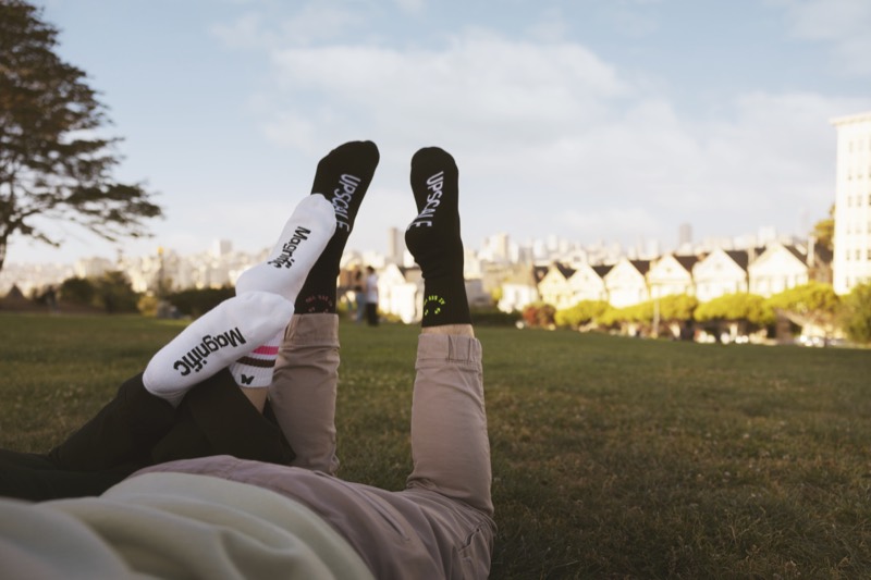
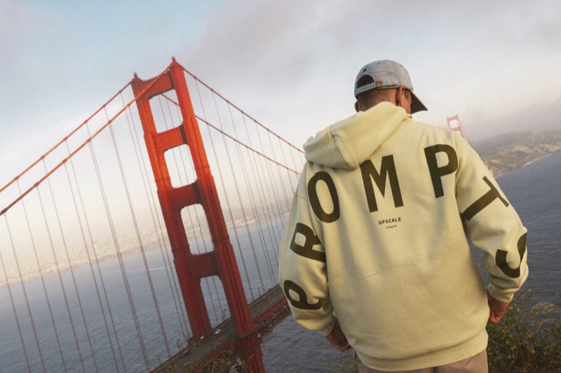
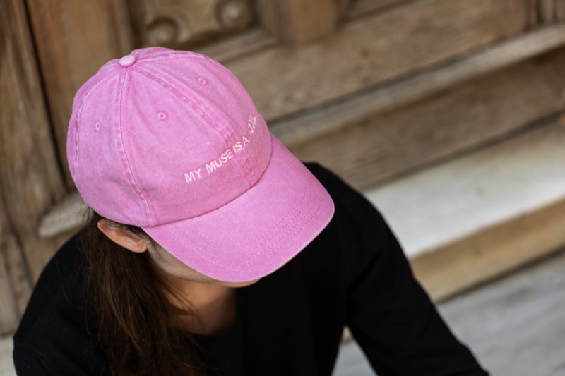
I take a special pride and put a lot of love into the Upscale merch. I wanted to make things people would actually wear outside the venue, not just another mug with a logo. I have to say that people love our merch and keep asking for it, which is probably the biggest compliment merch can get.
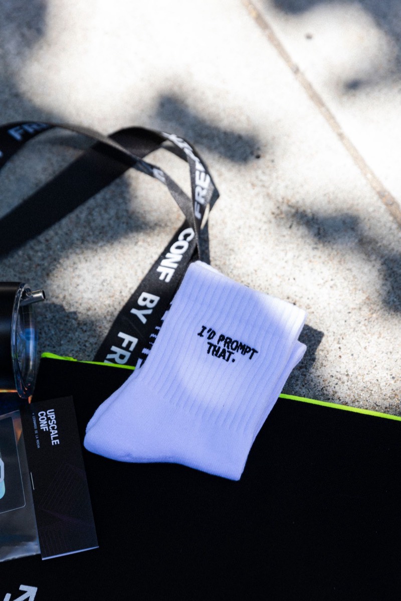
Still making pancakes
There was never one moment when we sat down and decided what the Upscale brand was going to become. It mostly grew because every edition asked something new of it.
I’ve learned that colors become much more complicated once they leave a screen, that a floor plan is never actually finished, and that something you’ve stared at on a laptop for weeks can feel very different when it’s suddenly twenty feet wide.
I’ve also learned that rules don’t necessarily make a brand less fun. Sometimes they just mean I’m no longer the only person who knows what “feels right” is supposed to mean.
Seeing people wear the things we made, take photos, get excited about details and take little pieces of the event home makes all the obsessing feel worth it.
The next Upscale Conf is in New York. I can’t tell you much about it yet.
Except that we’ve gotten a lot better at pancakes.
The pan’s hot.